
Education
B.Arch.Sci.
Toronto Metropolitan University
M.Arch.
Toronto Metropolitan University
Experience
Passions
Learning – Garnering new skills and knowledge whenever I can keeps me prepared for novel ideas and staying ahead of trends.
Playing – Tossing media into a sketchbook, kicking back with a video game, or overanalyzing rules to a board game keeps me excited about my world and the ways we can engage with it.
Making – Bringing new ideas to life brings me to life. Sharing my creative drive with friends, family, and students is my greatest passion.
My journey to becoming an educator has been enriching, albeit unconventional. After completing extensive studies in architecture and practising in architecture firms, I realized my true calling elsewhere in the realm of art education. This transition from offices to artist studios has allowed me to blend my architectural expertise with my passion for artistic expression and teaching.
My background in architecture has provided me with a unique perspective on art education. It has equipped me with a deep understanding of spatial construction, perspective, and the interplay of various media and materials. This multidisciplinary approach informs my teaching methodology by encouraging my students to explore diverse artistic techniques and materials. As an educator, I believe in fostering creativity through a choice-based instructional model. This approach empowers students to take charge of their creative process, promoting independence and self-direction. By offering a wide array of artistic media and techniques, I aim to help students discover their preferred modes of expression while developing a well-rounded skill set.
My artwork, characterized by vibrant colours and fantastical themes, serves as a testament to the power of combining technical skill with creative freedom. I strive to instill this balance in my students, teaching them to merge rigorous technique with uninhibited creativity. In the studio, I focus on building a supportive environment that encourages experimentation and risk-taking. I believe that by providing students with the tools to express themselves confidently across various media, we can nurture not just artists, but independent thinkers and problem solvers.
Art education should be a transformative experience; It should challenge students to push their boundaries, think critically about their work, and develop a lifelong passion for creative expression. As an educator, my goal is to guide students along their own artistic journey of personal growth, helping them to unlock new creative potential.
Infrastructures Series
In my ongoing “Infrastructures” series, I explore the overlooked beauty and complexity of Ontario’s utilitarian landscapes through impressionistic paintings that break the boundaries between two and three dimensions. Each work begins as a painted landscape, capturing the atmospheric qualities of light and weather as they interact with the towering structures that define our modern terrain.
Waking Giants
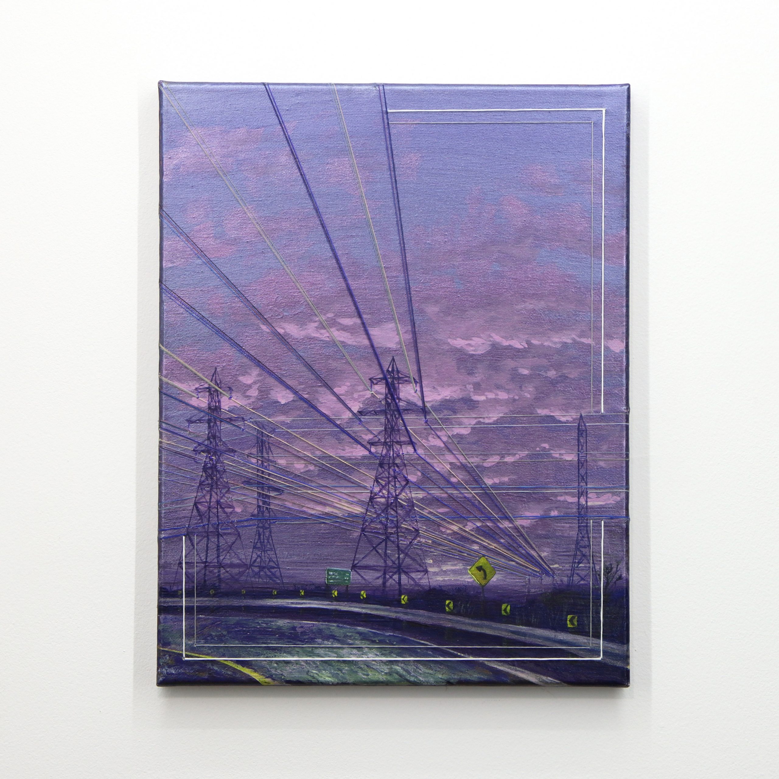
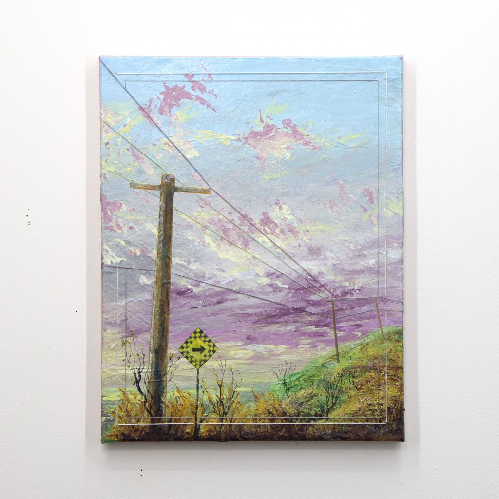
This work captures the monumental presence of electrical transmission towers as they march across the Ontario landscape in the fading light of dusk. The painting’s purple and pink atmospheric hues suggest the last remnants of daylight escaping toward the horizon, while the dark silhouettes of the pylons emerge like slumbering titans awakening in the twilight. Cotton thread embroidery traces the power lines and yellow road signs punctuate the foreground, their bright colour serving as beacons of human navigation within this infrastructural landscape. The embroidered frame creates a secondary compositional element, suggesting the ways in which these utilitarian structures frame our perception of the natural world.
The integration of cotton thread embroidery serves as both a literal and conceptual framework for these pieces. The embroidered lines trace the paths of overhead wires and cables, representing the invisible networks that connect our built environment. This stitching extends beyond the painted surface, wrapping around the wooden stretcher bars and anchoring the artwork to its physical construction. In this way, the embroidery becomes infrastructure itself – binding the work together while making visible the connections that typically escape our notice.
My architectural background informs my understanding of how these structures function within our landscape, yet as an artist, I’m drawn to their sculptural presence and the way they interrupt and define the horizon. The embroidered elements transform static paintings into hybrid objects that exist somewhere between traditional landscape painting and textile art, between representation and construction.
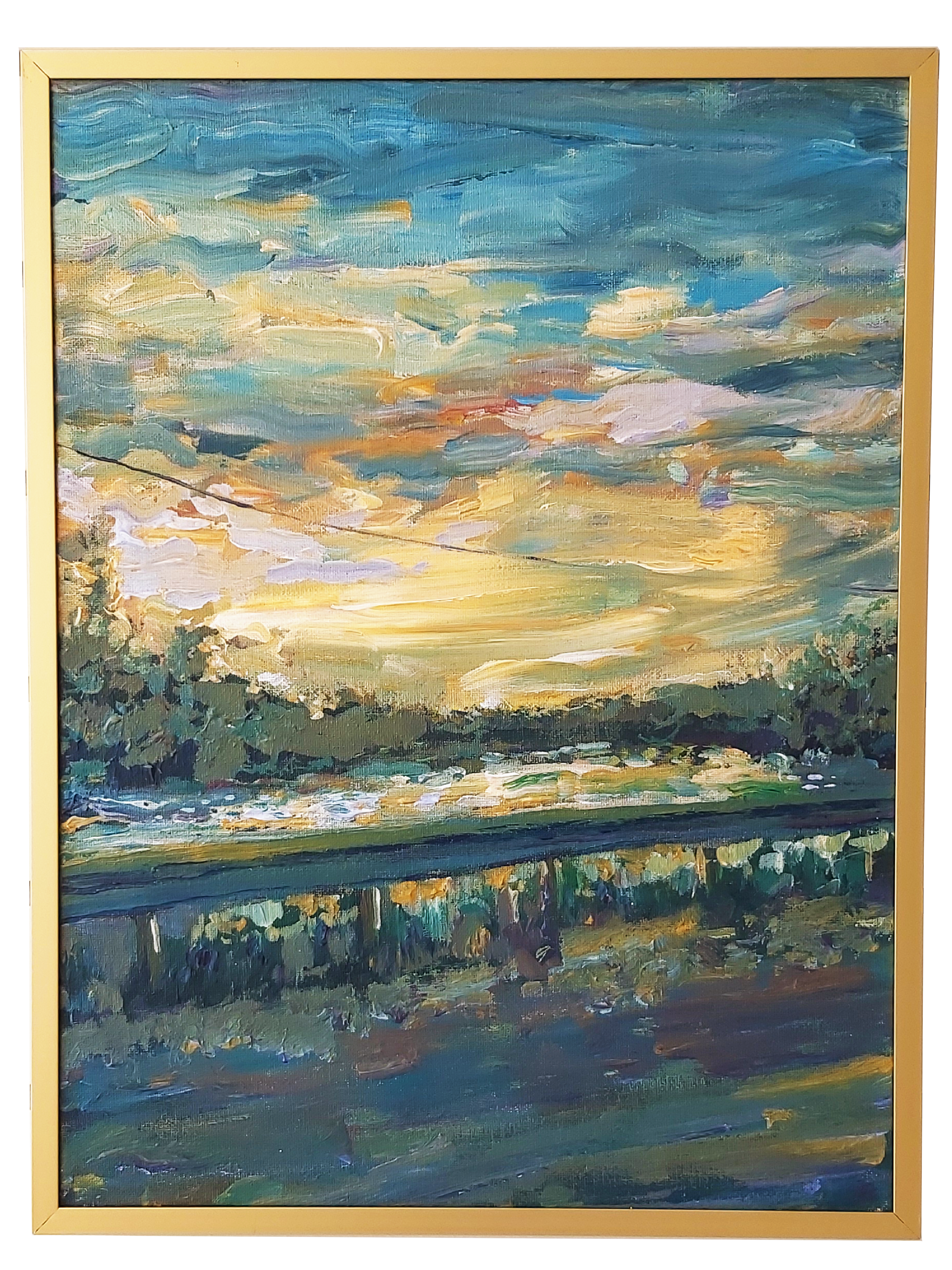
Silver Linings
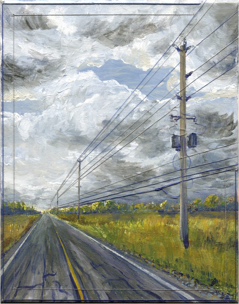
This scene captures the dramatic tension of an approaching storm along a rural county road. The painting’s turbulent sky, filled with gray and white clouds, creates a sense of atmospheric pressure and anticipation. A complex network of power lines stretches along the viewer’s journey down the road, their geometric patterns providing linear counterpoint to the organic chaos of the storm clouds above. The golden fields flanking the road provide warmth against the stormy sky, while the embroidered power lines become both the literal “silver linings” of the storm and the metaphorical connections that bind our rural landscapes together.
Through this series, I invite viewers to reconsider the aesthetic potential of our everyday infrastructural environment. The pylons, towers, and cables that we often dismiss as eyesores become protagonists in atmospheric dramas, their geometric forms creating rhythm and movement across the canvas while their embroidered counterparts literally connect the artwork to its own structural reality.
“Pay Attention to what you pay attention to.”
~ Amy Krouse Rosenthal
Morning Radio
This work presents an array of radio transmission towers reaching skyward through the blue-gray atmosphere of early morning. The painting captures that liminal moment when dawn pushes back the night’s gloom, with wisps of white clouds catching the first light. The vertical emphasis of the towers creates a rhythmic pattern across the canvas, their skeletal forms appearing both delicate and powerful against the moody sky. Cotton thread embroidery follows the guy-wires and connections between the towers, the stitched lines creating a web of communication that extends literally into the artwork’s construction. The embroidered elements wrap around the stretcher bars, making the painting’s infrastructure visible and connecting the depicted communication network to the physical reality of the artwork itself. This piece explores themes of connection and transmission, both in the subject matter and in the hybrid nature of the medium itself.
Turning Corners
This piece captures a moment of divergence where human navigation and electrical infrastructure follow separate paths through the landscape. The painting presents a dramatic twilight scene where purple and pink atmospheric hues dominate the sky, while a yellow diamond road sign commands attention in the foreground. The power lines refuse to bend with the road’s meandering path, instead maintaining their determined trajectory straight across the canvas, creating visual tension between human travel and electrical transmission. Cotton thread embroidery traces these persistent power lines as they cut across the composition, the embroidered framework creates literal infrastructure within the artwork itself.
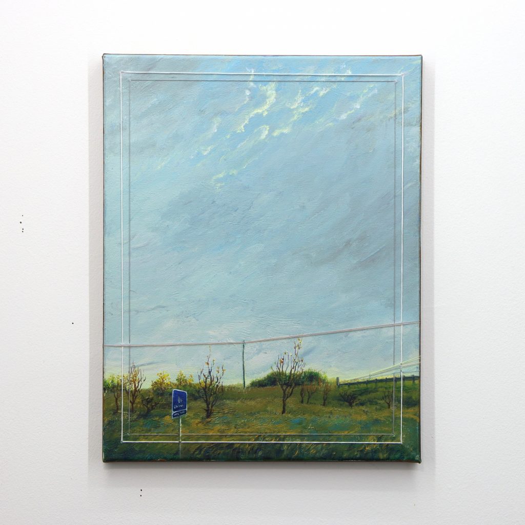
Making Detours
Here an expansive landscape is presented where multiple pathways unfold beneath a luminous blue sky streaked with golden light. The painting captures the optimistic possibilities inherent in choosing one’s route through the countryside, with a blue road sign anchoring the foreground while power lines stretch across the distant horizon. The composition emphasizes openness and potential, as rolling fields and scattered trees create a sense of unhurried exploration. Cotton thread embroidery follows the electrical connections that span the scene, the stitched lines creating a network of possibility that mirrors the multiple routes available to the traveller. Through soft atmospheric effects and gentle colour transitions, this piece celebrates the journey itself rather than the destination, finding beauty in the infrastructure that quietly supports our wandering.
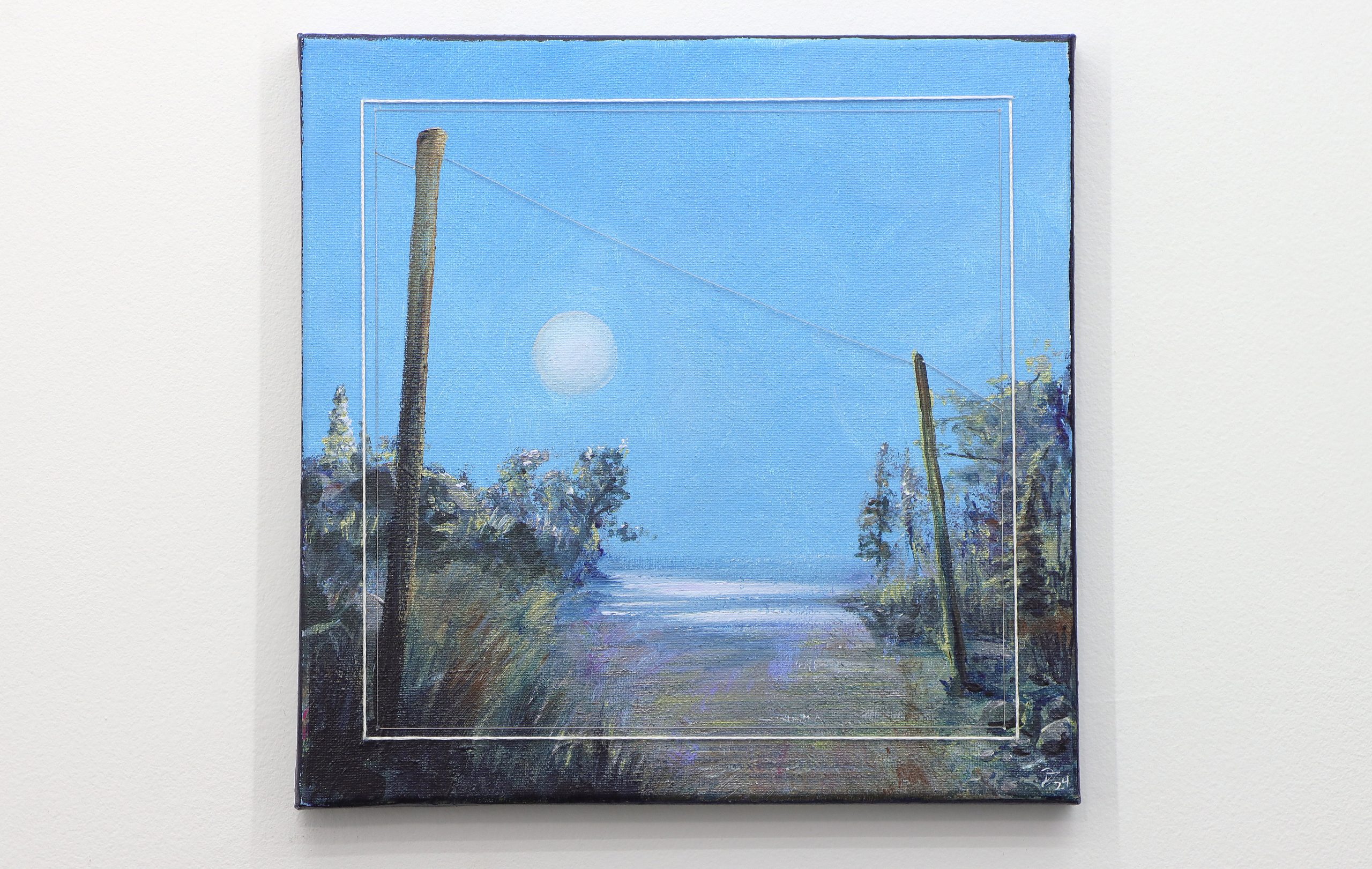
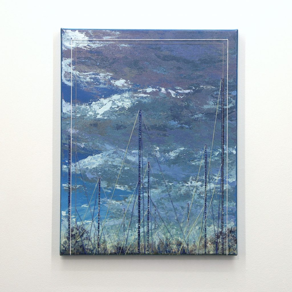
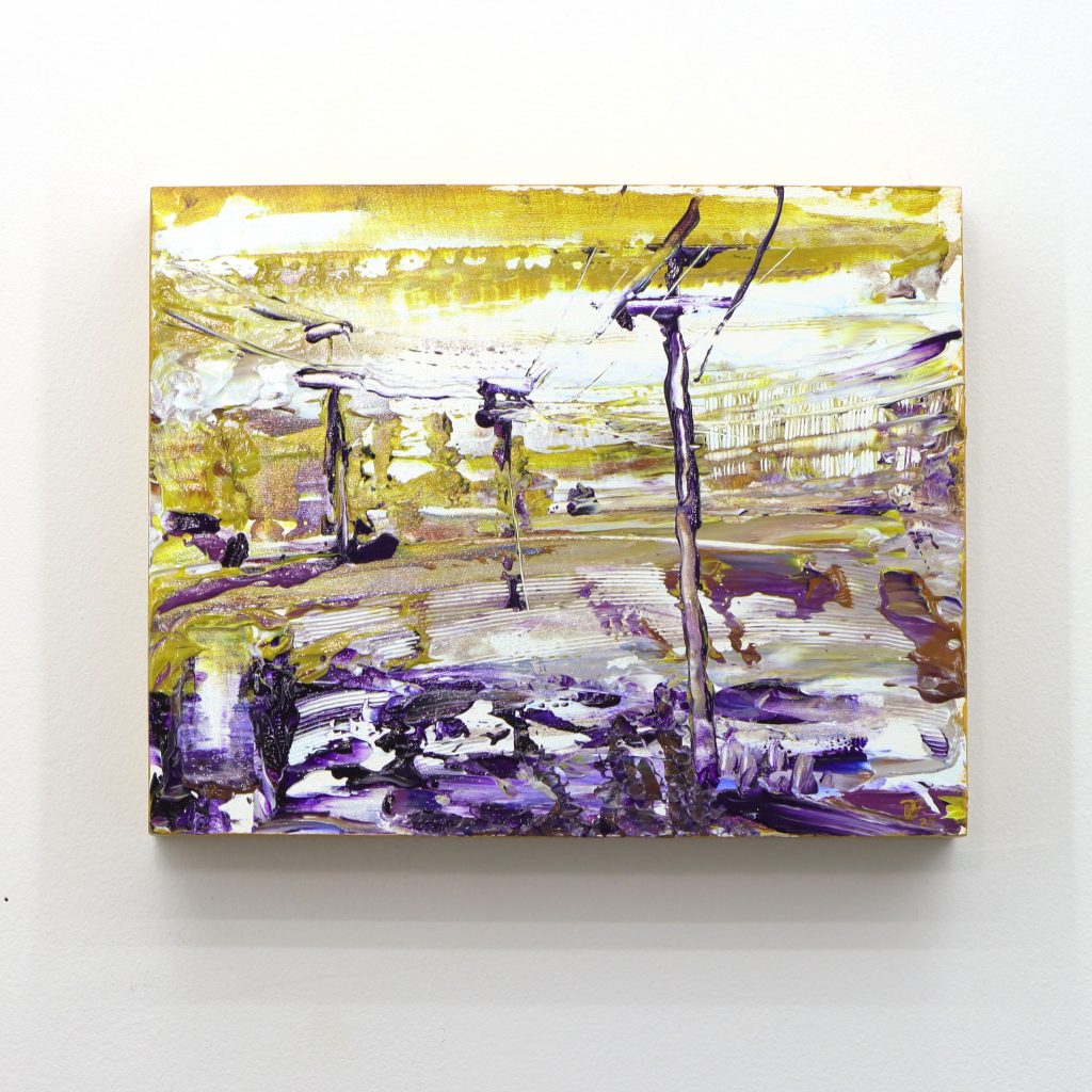
Low Powered
This small painting marks the beginning of the Infrastructure series, serving as an initial exploration of integrating embroidery into painted landscapes. This intimate work depicts a tranquil cove bathed in the soft, ethereal light of a full moon suspended in a clear blue sky. The minimal infrastructure present—simple power lines connecting utility poles—reflects the “low powered” nature of the scene, both literally and conceptually. The embroidered elements trace these modest connections across the peaceful landscape, establishing the series’ core concept of making visible the networks that connect our environments. where human infrastructure coexists quietly with the natural world.
Impressionism and Light
A setting sun, a shifting shadow, the calm before a storm. These intense moments of transition have always drawn inspiration for me. The way light grips the edges of our vision and dances colour through a place in time are like words in a poem.
Maria’s Swamp
Loose brushwork and rich colours combine behind contrasting infrastructure to bring the beauty of a swamp from Prince Edward County – home to close friends and fond memories.
I enjoy writing poems from time to time, and I find when I focus on the impressions of a special moment I feel a lot like I do when I paint. Each brushstroke I place attempts to capture and iterate that movement in time – each word combining and conflicting with meanings of this word and that. Colours in a palette contrast and uplift as all the strokes combine together to form rich poetry that only attempts to describe the feeling in a special moment.
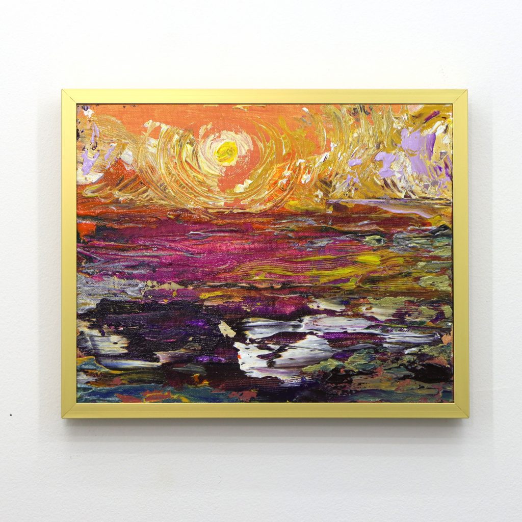
Sunset Impression
A hot summer sun is captured setting over a lake. The heat from the sun radiates through the sky with thick brushstrokes of paint billowing through from the background.
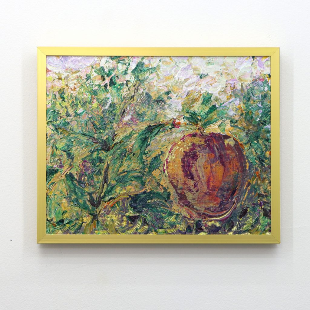
Apples Impression
Golden light radiates through wild foliage of a crab apple tree. Sun rays dance through the sky and cast bold ribbons into the apple’s skin.
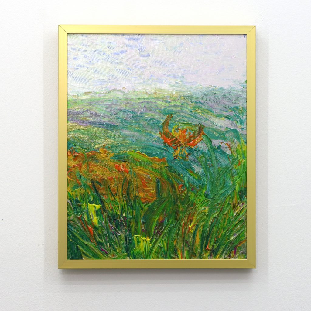
Lilies Impression
A soft fog dances across an open field with warm tiger lilies flowing with the movement. The dramatic orange hues of the flowers contrast with the teal and green grass surrounding them.
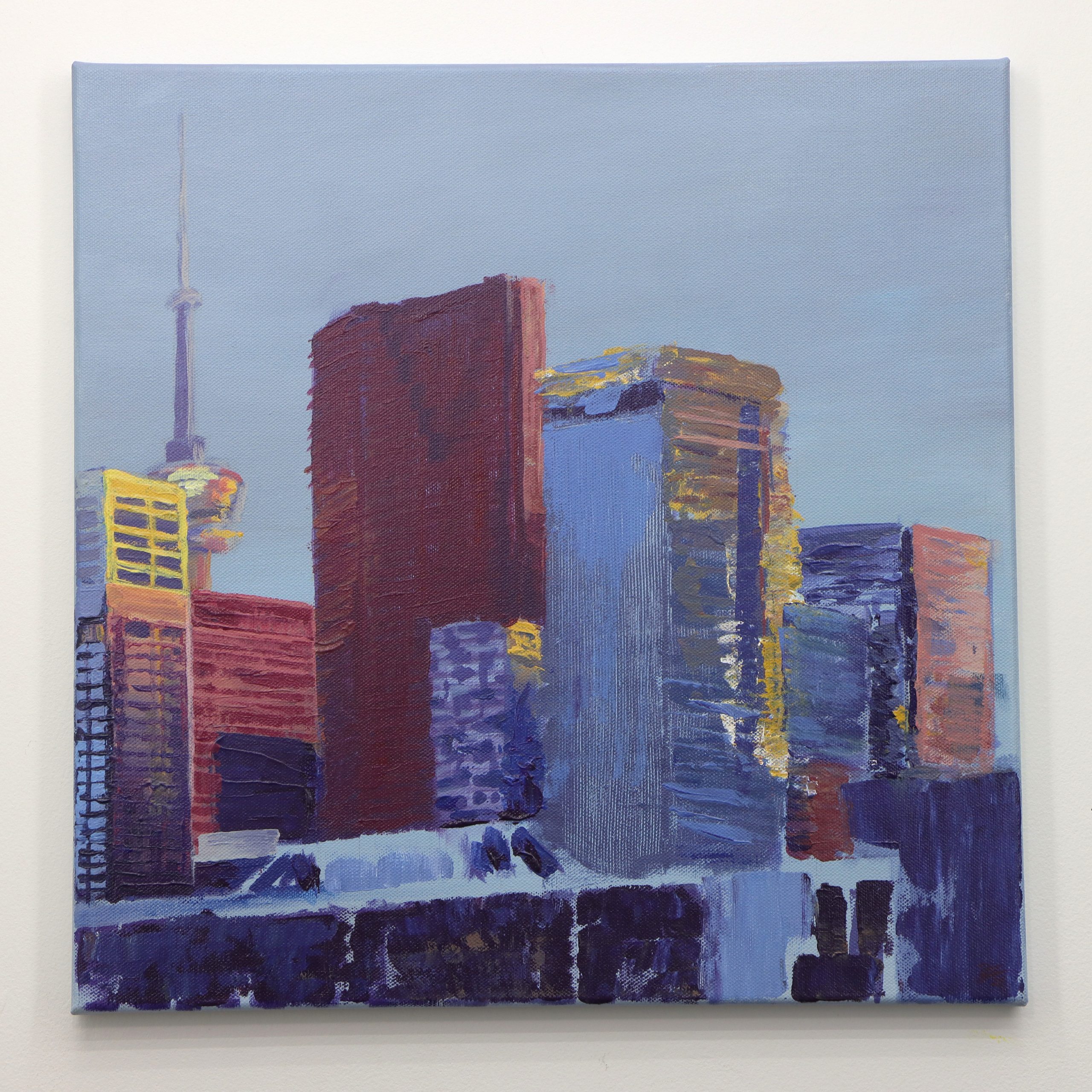
Toronto Evening Impression
A late summer sun covers Toronto in shifting warm tones while stark evening purples and blues creep into the buildings.
“Some days, it seems to me like the purpose of life is to convert energy into beauty.”
~ Hank Green
Colour Studies
My relationship with colour has undergone a profound transformation throughout my artistic journey. Coming from an architectural background where I embraced the “white box aesthetic,” I initially approached colour with both fascination and trepidation, often omitting it entirely from my work.
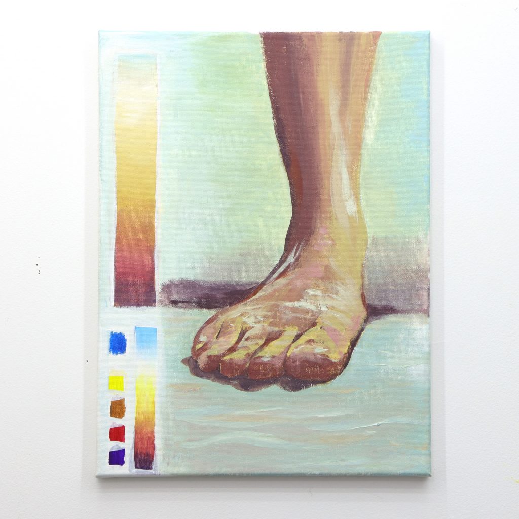
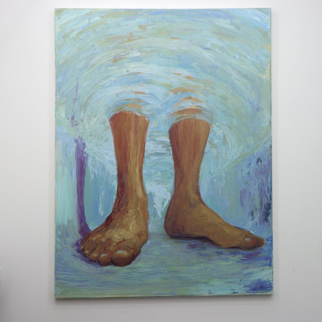
Foot Study
A lighting study capturing skin tone and applying a colour gradient matching the Kelvin lighting scale.
This avoidance stemmed from feeling overwhelmed by colour’s complexity and potential, but I recognized that as an artist, this limitation would need to be confronted.
This realization led me to undertake a systematic exploration of colour theory, delving into both the physics of colour and the psychology of perception. By applying challenging concepts directly to my practice, I gradually developed confidence and fluency with this fundamental artistic element.
Through dedicated study and experimentation, I’ve not only overcome my initial fear of colour but have also learned to guide others through similar discoveries.
This body of work represents both a personal breakthrough and a teaching methodology, demonstrating how direct engagement with complex materials can transform perceived limitations into strengths.
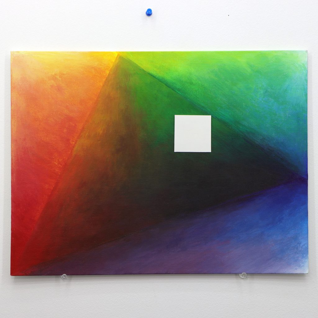
Cad Cad Ultra Gamut
The full range of colours available using Cadmium Red (Med hue), Cadmium Yellow (Med Hue), and Ultrablue, along with the tinted values using Titanium White. The white square in the center is used for white balancing and contrasting against the black tones formed in the gamut.
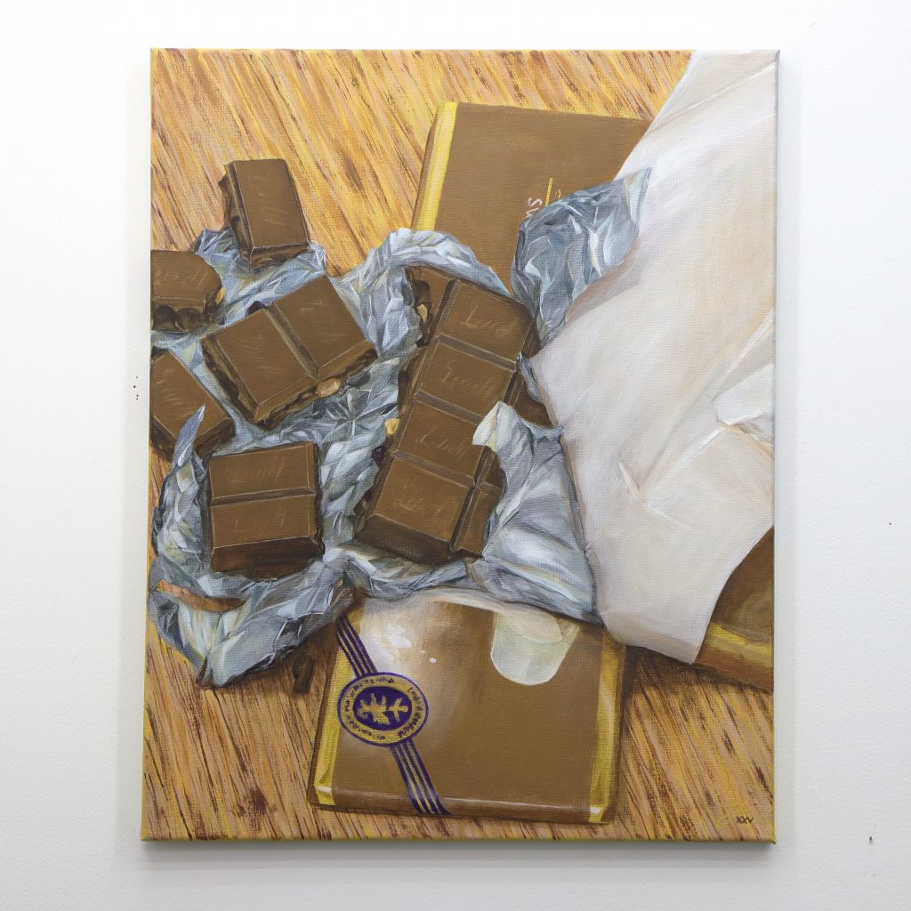
Swiss Chocolate
A still life scene painted to practice metallic tones and geometric forms.
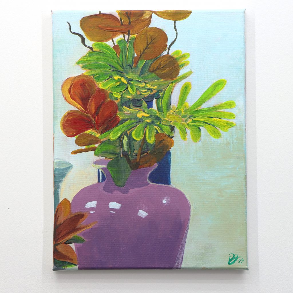
Flower and Vase Study
With a focus on colour and yellow light, this still life elevates its hues to bring an heir of life into an arrangement of artificial flowers.
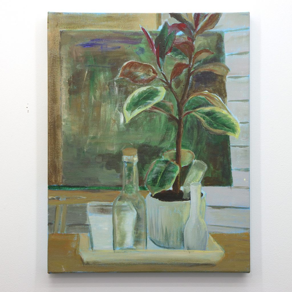
Plant and Bottles Study
A quick still life study focusing on subtle colour variations on various surfaces.
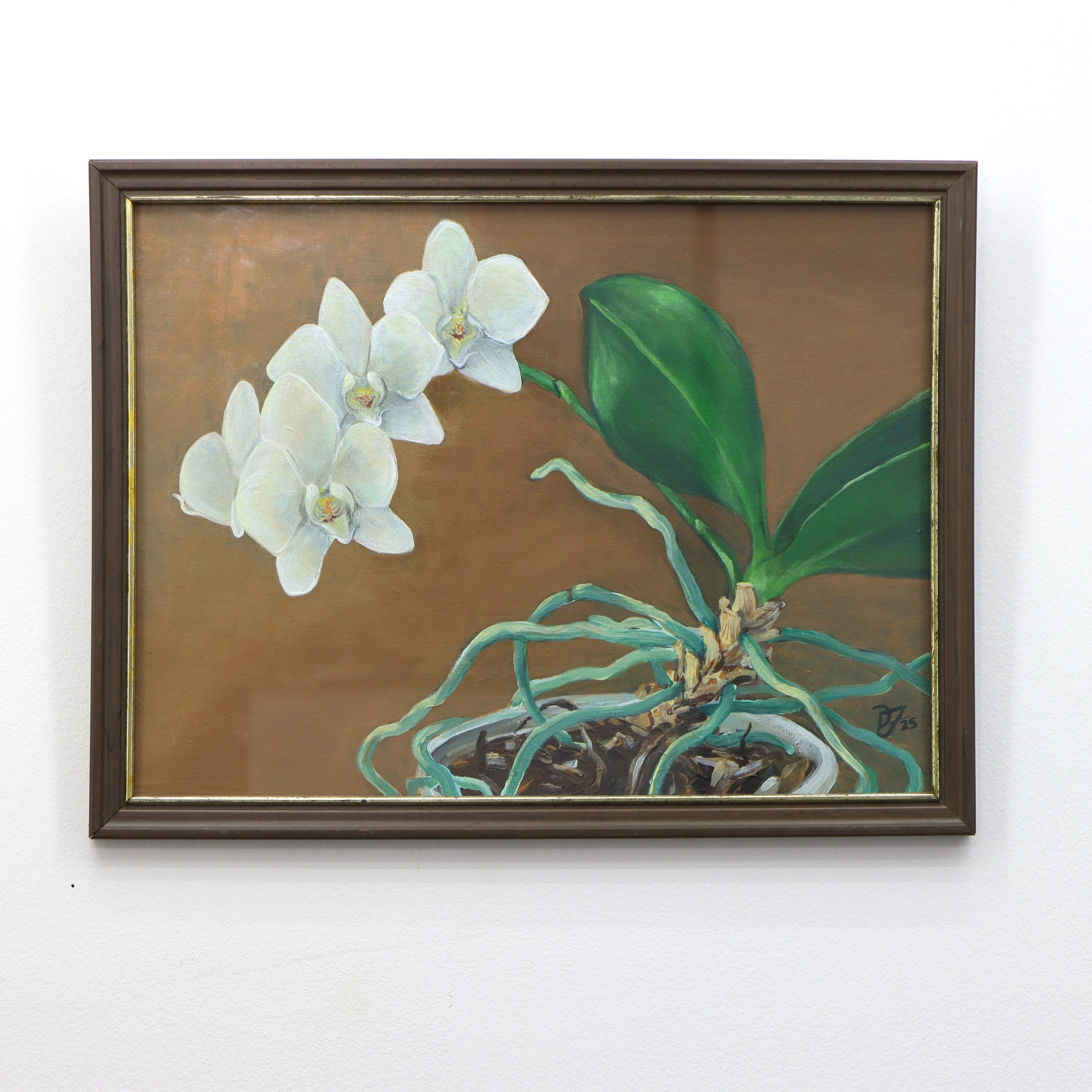
Orchid Study
A still life painting focusing on natural forms and soft romantic lighting conditions.
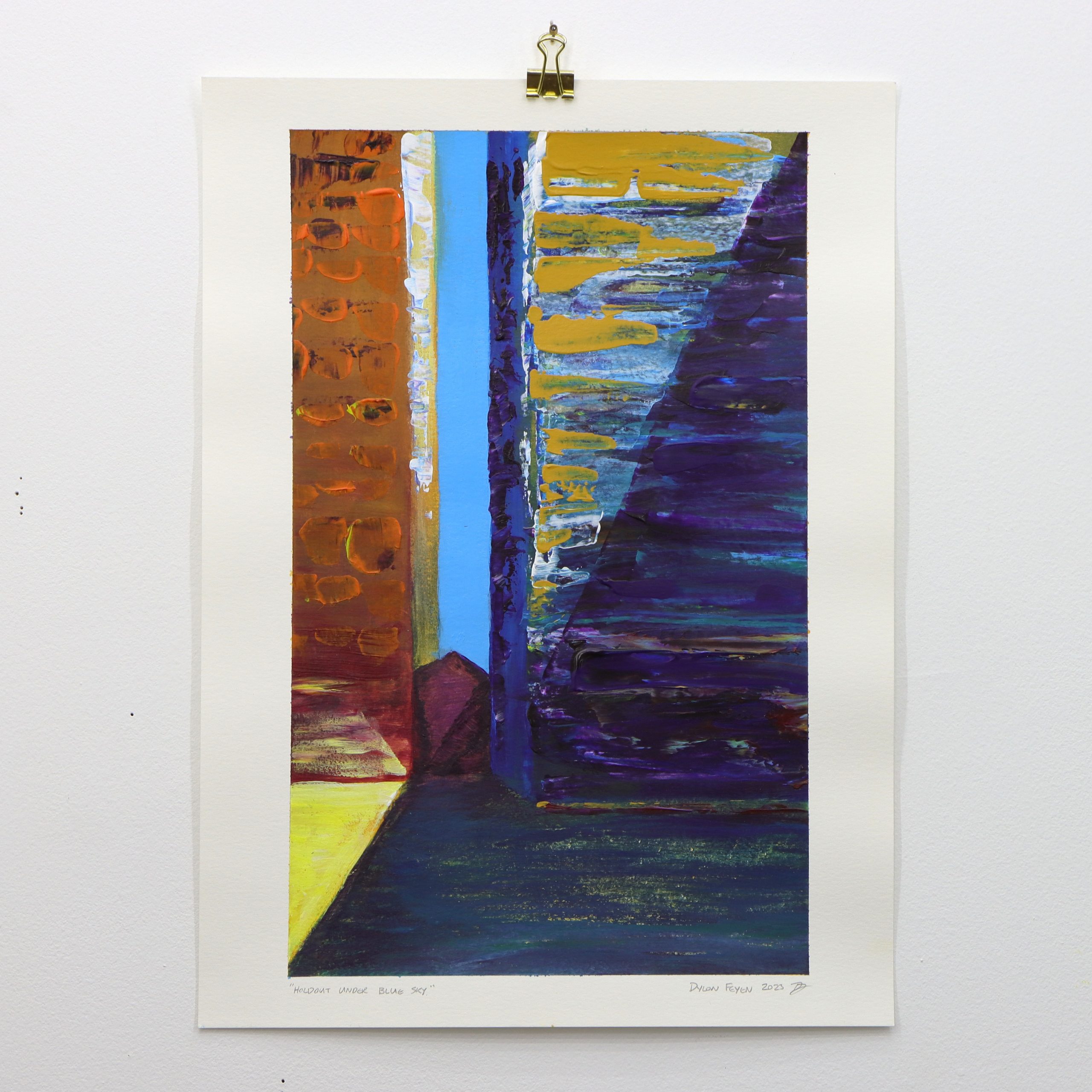
Holdout Under Blue Sky
This foundational piece establishes the series’ central tension between permanence and transformation. The artist juxtaposes a weathered red brick structure against towering glass facades, creating a visual narrative of urban resilience.
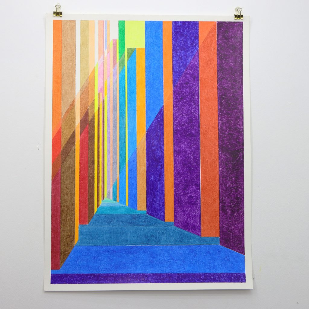
Glass Crayon Series
In my ‘Glass Crayon’ series, I confront the challenge of colour head-on, transforming the familiar skyline of Toronto into vibrant, atmospheric vignettes using an unexpected medium: Crayola wax crayons.
This series represents my exploration of atmospheric perspective and colour study. Each piece is meticulously planned using mathematical proportions derived from the golden ratio and abstracted perspective, creating a foundation that bridges architectural precision with artistic interpretation.
I chose Crayola crayons for their rich vibrancy, saturation, and diverse palette. This seemingly simple medium imposed strict limitations that paradoxically focused my creativity on the essentials of colour, composition, and construction. The infantile associations of crayons juxtapose with the sophisticated urban landscapes they depict.
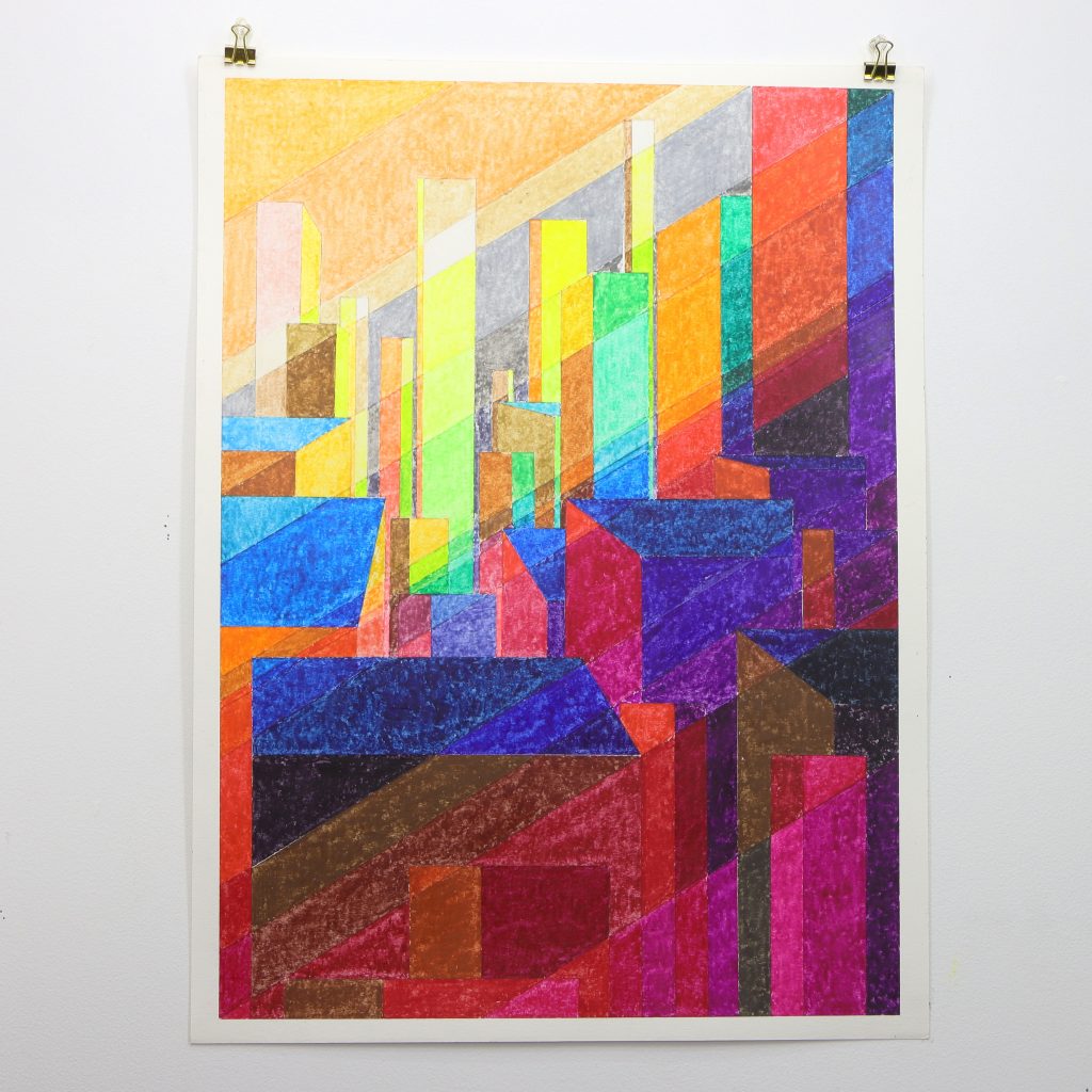
Glass Canyon
This work transforms Toronto’s urban landscape into a vibrant celebration of colour and light paying respect to the city’s welcoming queer community. The carefully orchestrated colour relationships demonstrate beautiful precision while maintaining an intuitive warmth. The receding blue pathway draws viewers deeper into this canyon of light, symbolizing the journey toward acceptance and belonging in a place.
My process involved rigorous colour study, with each hue carefully selected and tested against numerous others to achieve specific conditions of contrast and unity. This painstaking approach allowed me to delve deep into the relationships between colours, examining how each shade affects and is affected by its neighbours.
The resulting pieces exhibit an unexpected depth, with architecture that seems to emerge from and recede into the paper. This series not only showcases Toronto’s urban beauty but also demonstrates the potential for depth and complexity in a medium often dismissed as childish.
Through this project, I’ve not only honed my skills in atmospheric perspective but also discovered new avenues for exploring the intersection of precise planning and intuitive colour work. The ‘Glass Crayon’ series stands as a testament to the power of embracing limitations as a catalyst for artistic growth and innovation.
Glass Jungle
This dynamic composition captures the overwhelming sensory experience of urban awakening. The artist employs fragmented geometric forms in brilliant yellows, greens, and purples to evoke the disorienting beauty of morning in the metropolis. Angular shapes intersect and overlap, creating a sense of controlled chaos that mirrors the complexity of city life. The warm yellow light filtering through the composition suggests dawn breaking over the urban landscape, while the varied textures achieved through crayon technique add tactile depth to the glass and steel environment.
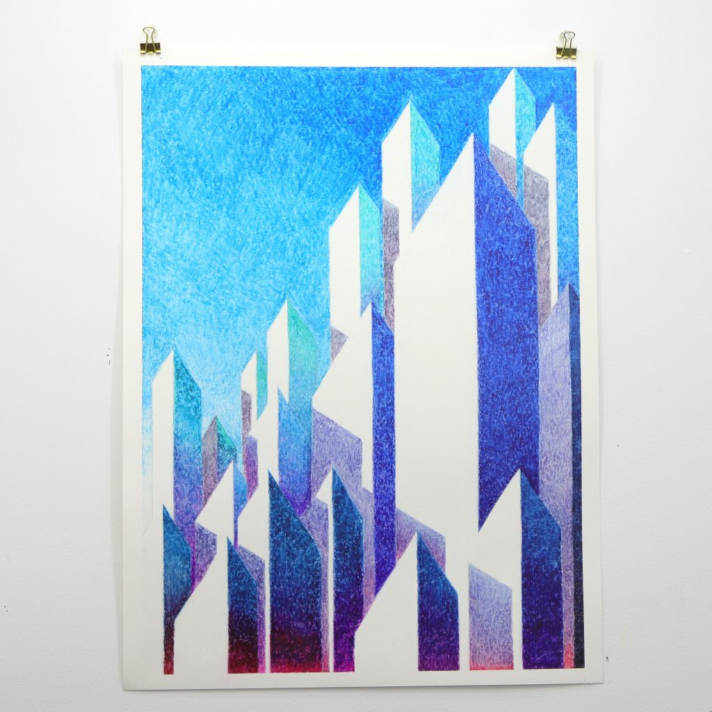
Glass Mountain
The artist adopts a monochromatic blue palette to explore themes of distance and reverence. Sharp, crystalline forms rise like mountain peaks against a gradient sky, creating a sense of awe and intimidation. The cool blue tones evoke the detachment of an outsider observing the city’s imposing architecture. Through careful manipulation of value and saturation, the work achieves remarkable atmospheric depth, with buildings appearing to emerge from and dissolve into the ethereal background. The piece reflects on urban power structures and the humbling experience of approaching an unfamiliar metropolis.
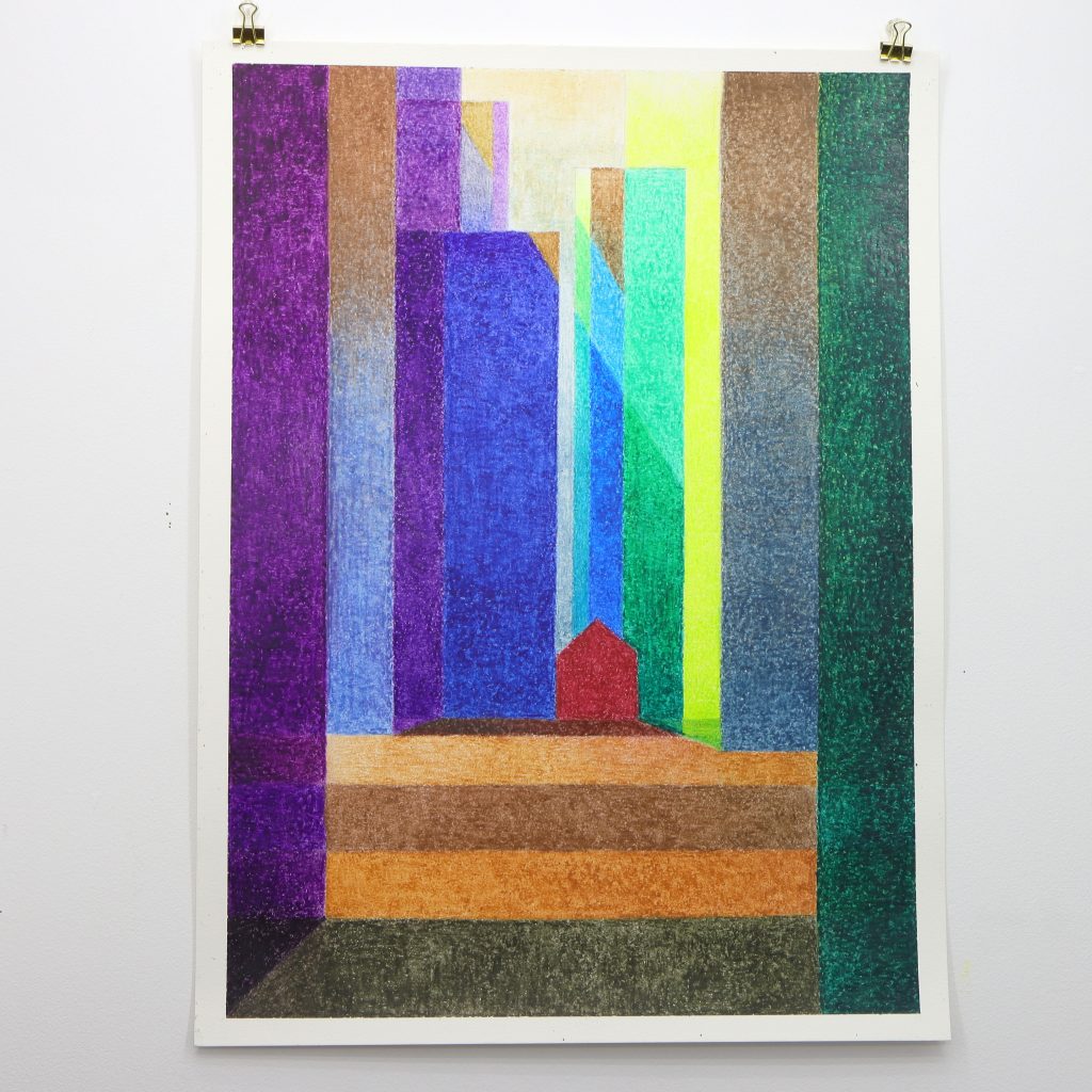
Glass Thorn
This provocative piece challenges the homogenization of urban architecture. The artist presents a small red structure defiantly positioned among towering vertical bands of purple, blue, and green. The historical building appears as a stubborn remnant, disrupting the otherwise orderly progression of glass towers. The warm earth tones of the foreground steps provide stability, while the riot of colours above suggests the overwhelming presence of modern development. Through this visual metaphor, the work questions what is lost when cities prioritize uniformity over architectural diversity and cultural memory.
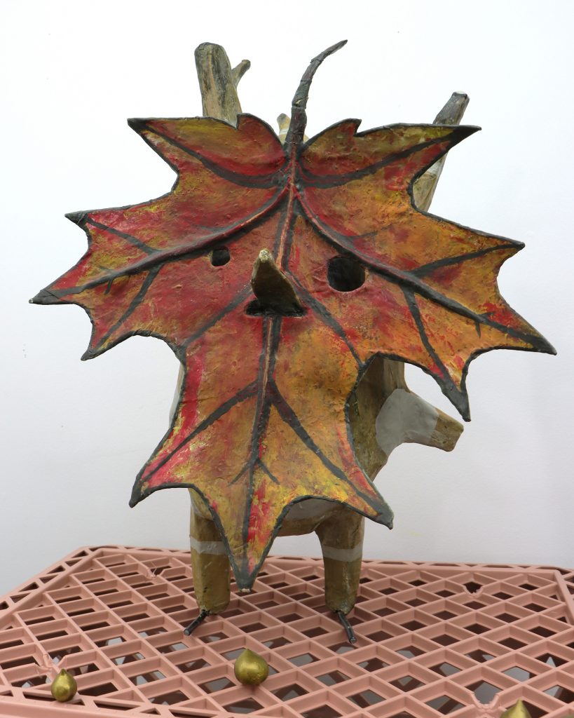
Sculptures and Silly Things
This is a small handful of things that once gripped my attention from the great immaterial world.
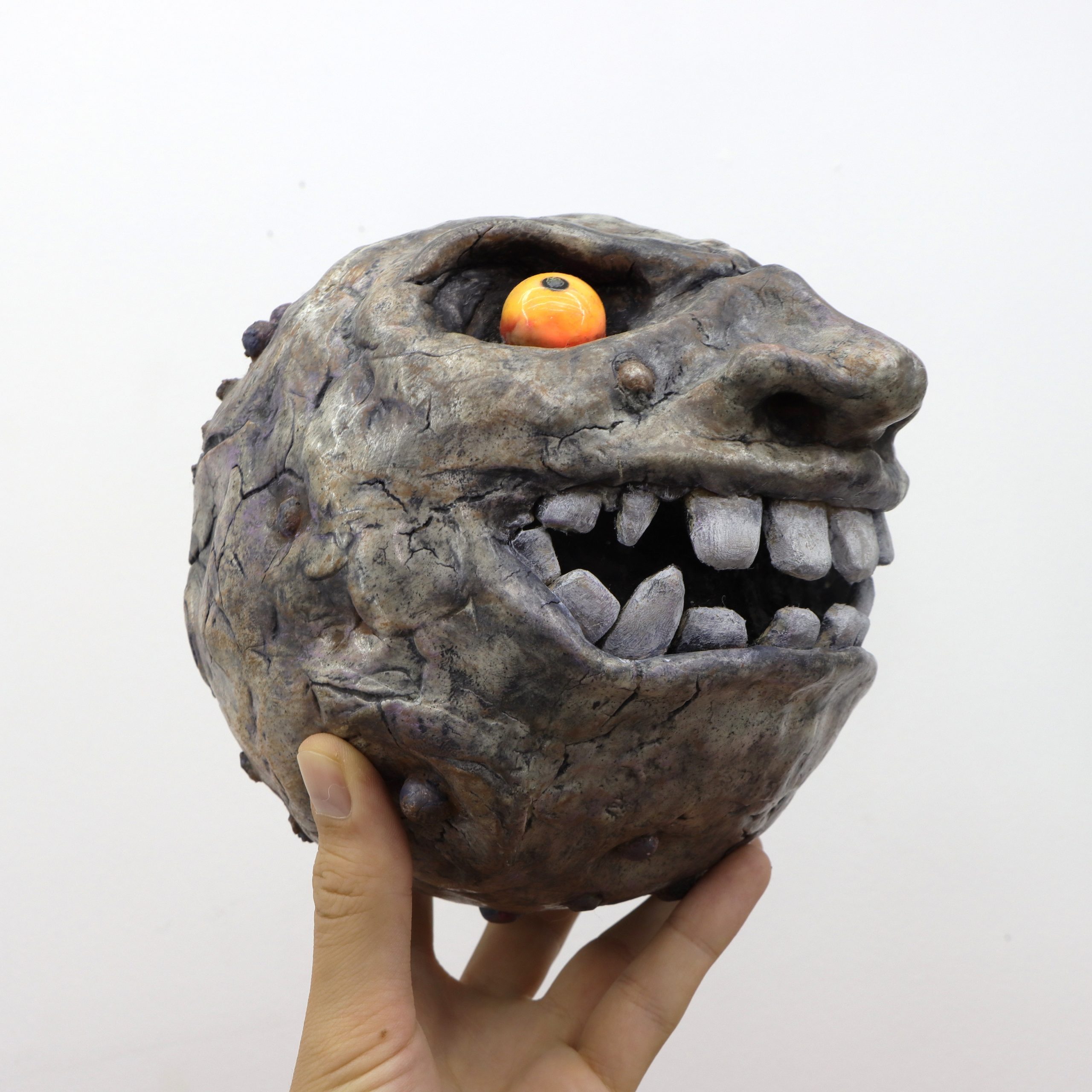
Majora’s Moon
A small sculpture depicting the antagonistic moon from 2000’s The Legend of Zelda: Majora’s Mask.
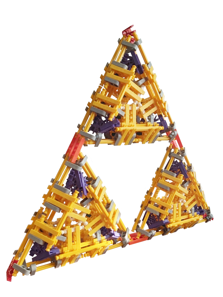
K’nex Triforce
An engineered sculpture utilizing rotational symmetry to build non-orthogonal shapes with the K’nex building system.
Goose the korok
Another Zelda related sculpture. This original character came to life after the curious question “What would a Canadian born Korok look like?” was asked.
Sometimes I’m inspired by my favourite video game series, or perhaps from a show or nothing at all. These works flex my sculptural knowledge of materials to bring something fun to life!
“We’re so busy watching out for what’s just ahead of us that we don’t take time to enjoy where we are.”
~ Bill Watterson
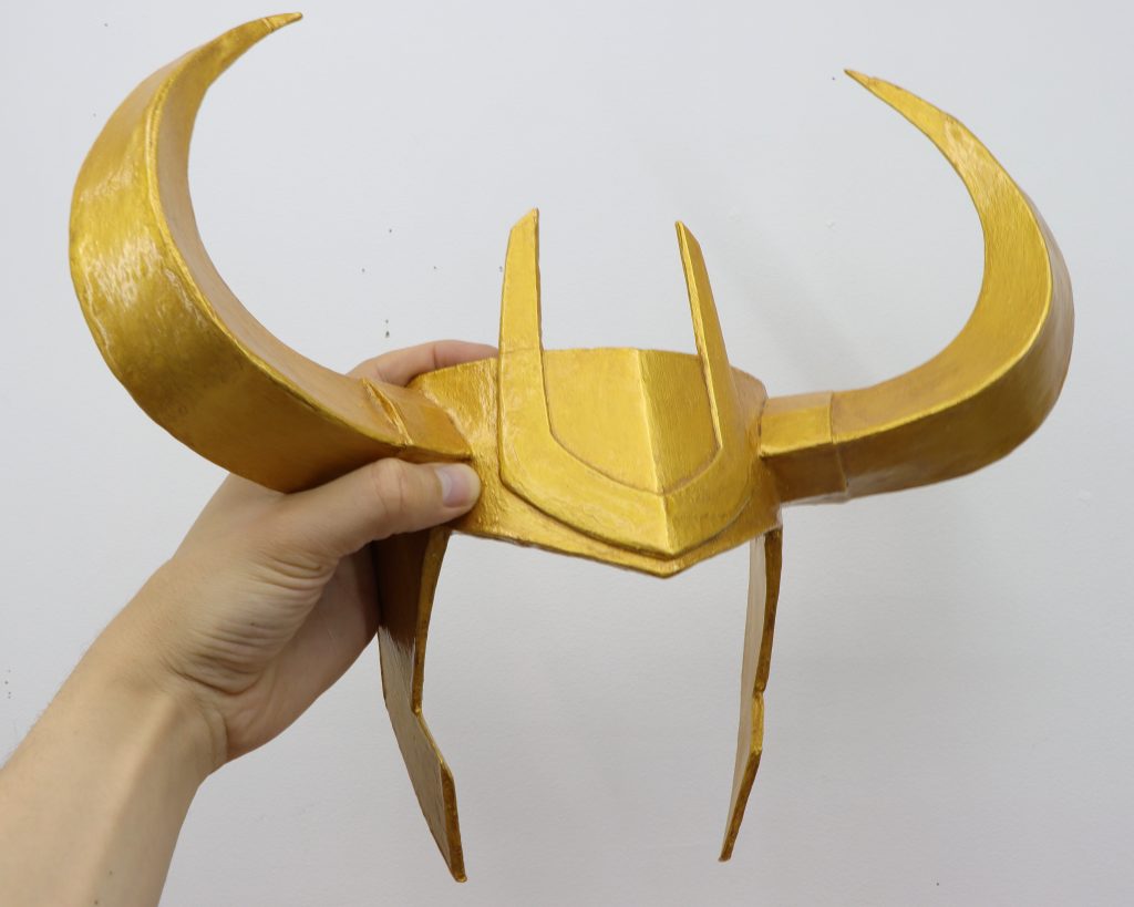
Loki’s Horn
A complex mask made originally for a Halloween costume now lives on as a precious artifact.
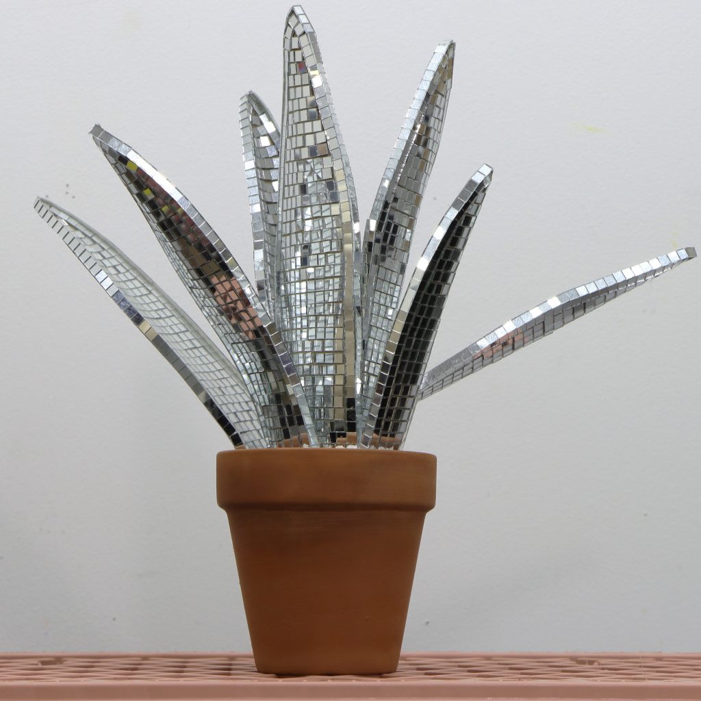
Disco Trifasciata
A simple looking sculpture conceals complex organic shapes studied to form the paper leaves that hold the mirror mosaic.
“My experience of life is that it is not divided up into genres; it’s a horrifying, romantic, tragic, comical, science-fiction cowboy detective novel. You know, with a bit of pornography if you’re lucky.”
~ Alan Moore
Expressionism and Feeling
Like many artists, I use my mediums as tools to communicate how I’m feeling and how I’m processing the world around me.
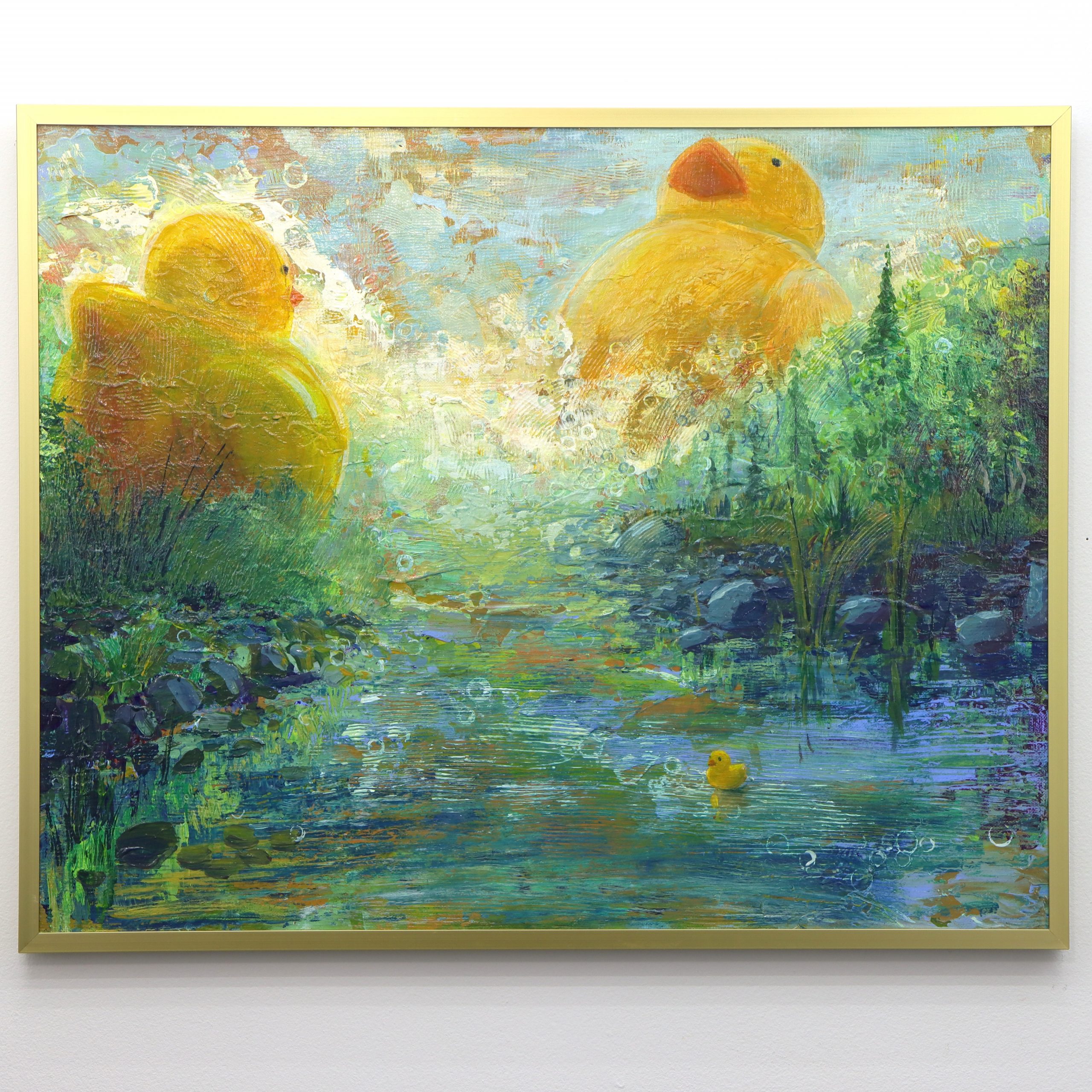
Rubber Duck River
The artist explores scale and childhood wonder as oversized rubber ducks burst into a scenic river landscape. Rich textures and dynamic motion create a sense of playful fantasy within a comforting natural setting.
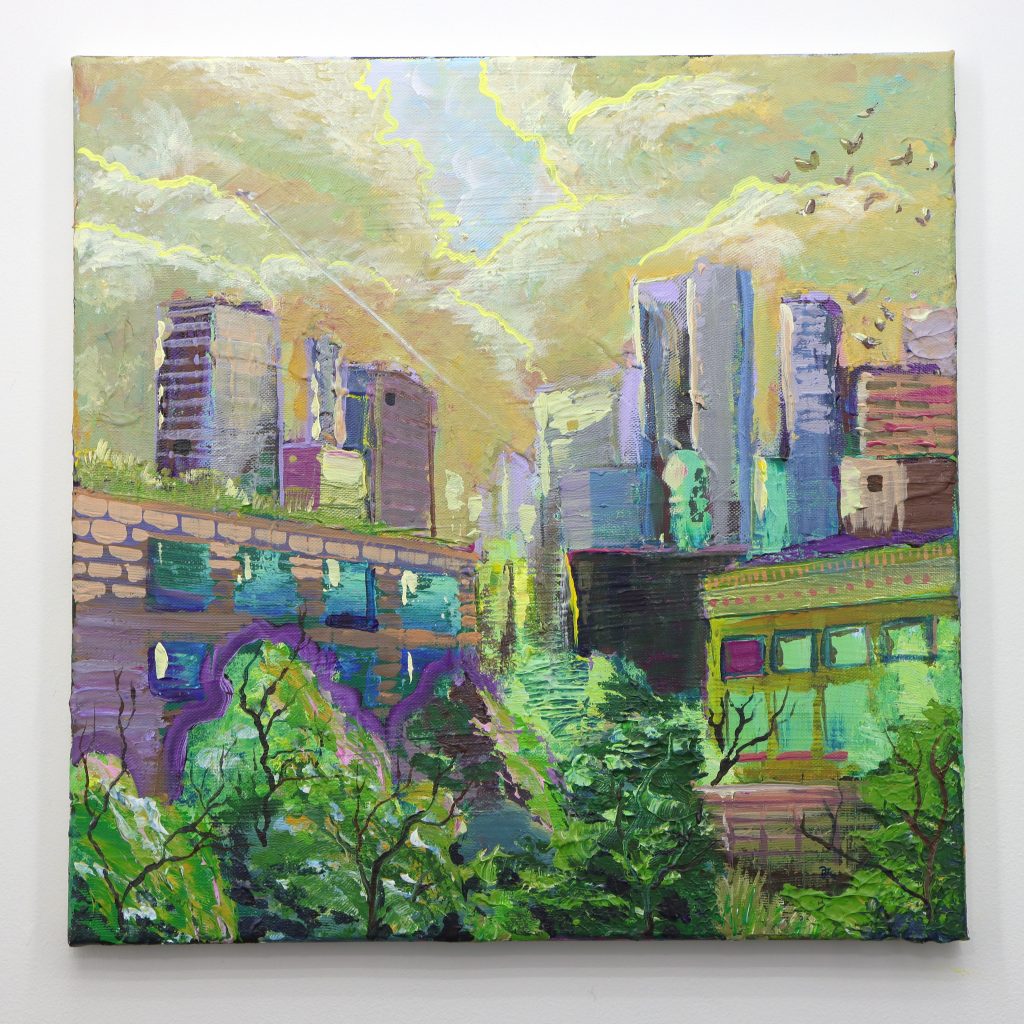
Dreaming City
Crafted over multiple sessions using leftover paint from student palettes, this urban landscape evolved dramatically with each teaching session. The layered composition speaks to wholeness found through individual creative expression.
Cold Feet
A warm bath becomes a site of complex emotions, where traditional comfort transforms into unease. The swirling blues and earth tones explore how familiar spaces can shift meaning during moments of personal healing.
“The toughest thing is to love somebody who has done something mean to you. Especially when that somebody has been yourself.”
~ Fred Rogers
I develop art skills the way one builds a vocabulary. Once I’m confident enough, literate enough in my chosen medium, I write essays on my canvas. I speak through colours and my lines carry my emotional perspective.
Swept Industry
This work depicts a dramatic marshy landscape where industrial structures emerge through luminous golden fog. Vibrant purples and yellows create atmospheric tension as skeletal infrastructure punctuates the wetland scene with stark vertical lines.
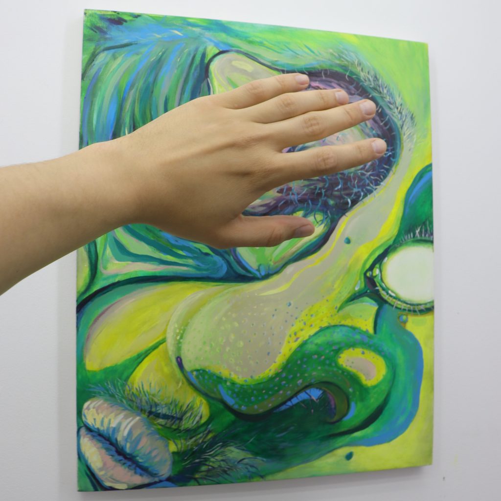
Self Portrait 2024
Distorted features emerge through bold gestural marks, depicting both personal and external forms of harm. The artist literally grips a phallic brush to smear paint across the image, making the metaphorical concept of expressing hurt through art physically manifest.
This body of work represents my most personal investigations into feeling and experience. Each piece emerges from a specific emotional state or life circumstance, translated through colour theory and gestural mark-making.
The paintings range from playful explorations of childhood wonder to more complex examinations of vulnerability, healing, and self-perception. Through abstraction and expressive colour relationships, I attempt to make visible the internal experiences that often remain hidden—the comfort found in familiar spaces, the complexity of personal growth, and the ongoing dialogue between our inner and outer worlds.
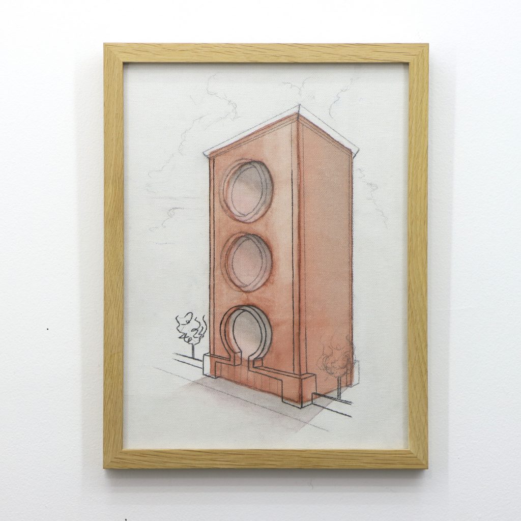
Brick Building
This architectural intervention is one of the artist’s earliest pieces exploring scale. This and the partner piece are from before the artist’s deviation into architecture. The piece reevaluates our expectation of building and building material.
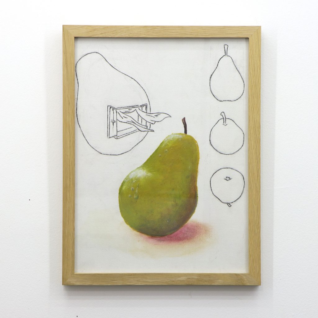
Open Pear
Contradicting expectations, this piece expresses the idea of fresh space more literally and considers the architectural qualities of a pear.
Through my art and teaching practice, I continually challenge myself to embrace the varied perspectives that define the human condition. My youngest students often remind me that the world moves forward regardless of how strange or uncertain things may see – a lesson in resilience that profoundly shapes my work. This capacity to express different viewpoints is fundamentally what makes us human.
My artistic exploration centers on challenging established thoughts and ideas while navigating the complex gray zones of perception – knowing when to question, when to respect, and when to revere. Each value we hold emerges from personal experience and learned lessons, but what we choose to do with these values is what makes each individual irreplaceable. Whether depicting the overlooked beauty of utilitarian landscapes or processing personal emotions through colour and form, my work seeks to honour these diverse ways of seeing and being in the world.
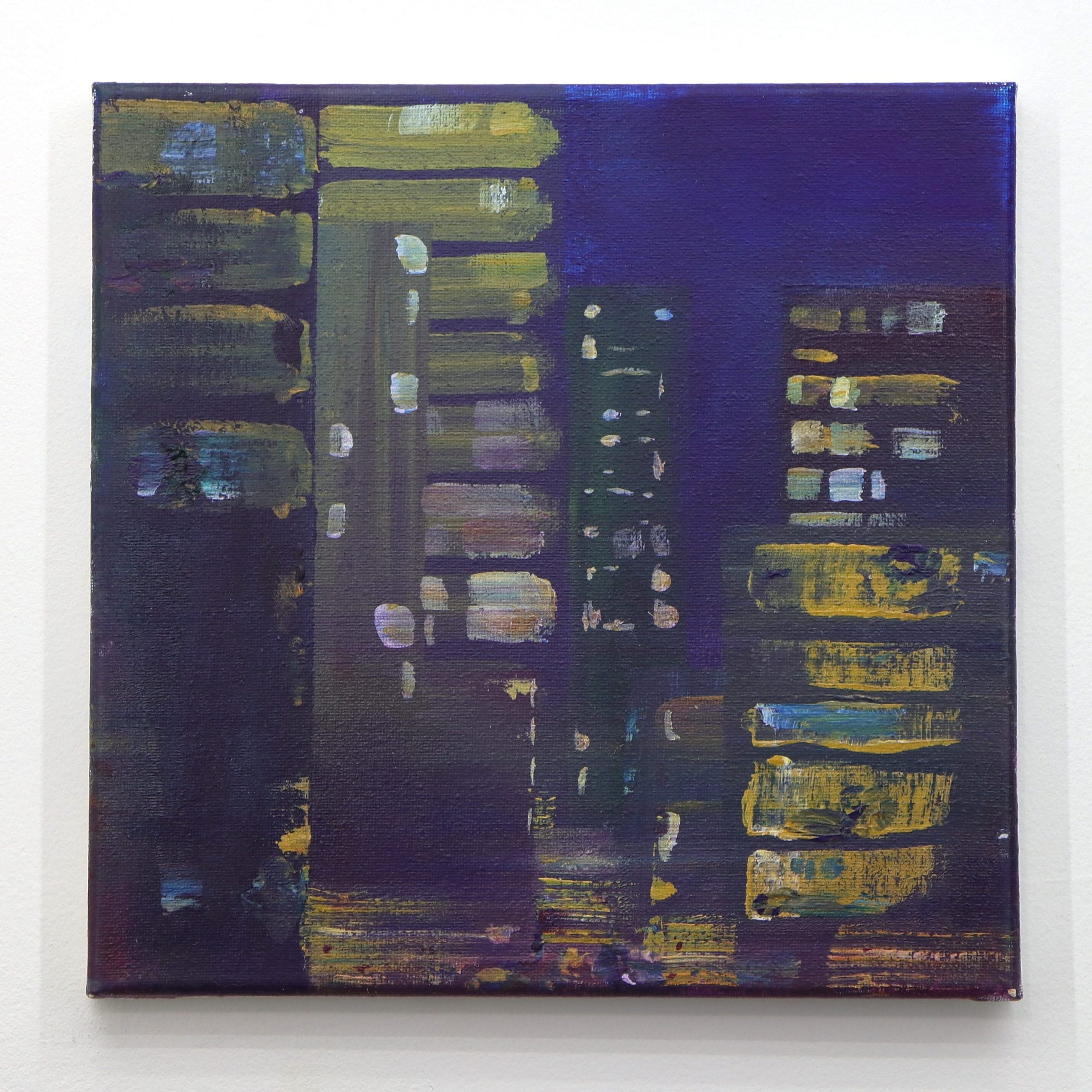
Toronto Night Expression
This work captures the pulsing vitality of urban nightlife through a rich tapestry of deep purples and scattered illuminations. Windows become luminous portals in the darkness, their warm yellows and blues suggesting the countless individual stories unfolding within. The painting’s layered brushwork creates a sense of movement and energy, as if the city itself is breathing. Through bold impasto and fragmented forms, the work conveys the paradox of urban isolation and connection, where millions of lives intersect yet remain mysteriously separate in the nocturnal cityscape.
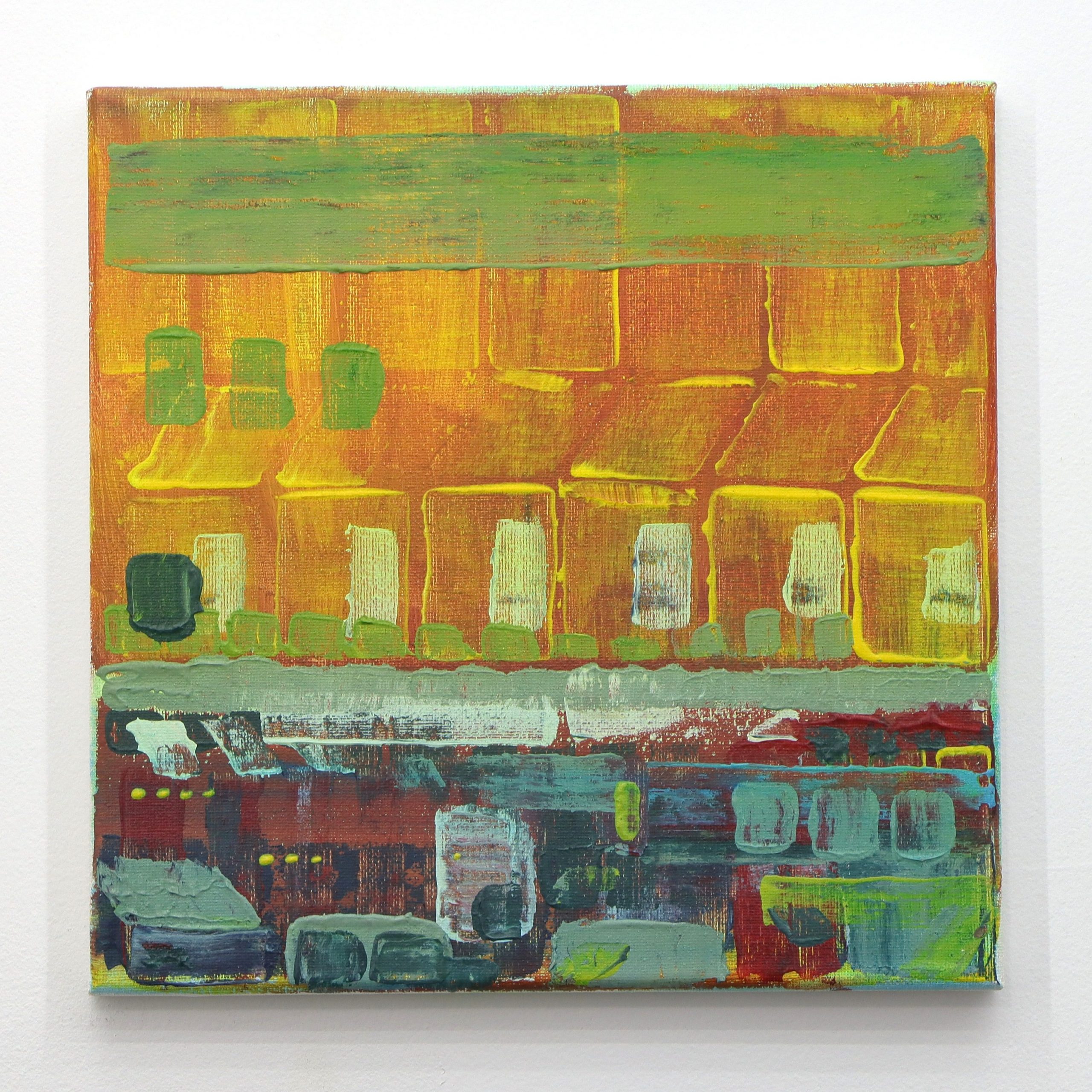
Toronto Transit Expression
This dynamic composition transforms the mundane experience of public transportation into a symphony of motion and colour. The artist divides the canvas into distinct zones of activity, with warm oranges and greens dominating the upper architectural elements while cooler blues and grays animate the transit level below. Bold brushstrokes and gestural marks convey the relentless energy of commuters, creating a visual rhythm that mirrors the constant flow of urban movement. The painting captures both the mechanical precision of the transit system and the human chaos it contains, celebrating the organized disorder of city life.